gCLUTO Documentation
Matt Rasmussen, Mark NewmanUniversity of Minnesota. Copyright 2003
Last Modified: Mon Jan 20 12:33:38 CST 2003
http://www.cs.umn.edu/~mrasmus/gcluto
gCLUTO (Graphical CLUstering TOolkit) is a graphical front-end for the CLUTO data clustering library. Its purpose is to make CLUTO's clustering abilities available in a user-friendly graphical way. In addition, gCLUTO provides several ways to interactively visualize clustered results. A copy of gCLUTO can be found at http://www.cs.umn.edu/~mrasmus/gcluto. For more information about CLUTO visit http://www.cs.umn.edu/~karypis/cluto.
gCLUTO is currently in an alpha phase. The purpose of this release is to explore what features and user interface designs would work best for a clustering application.
Currently, gCLUTO is available for both Linux and Microsoft Windows platforms. To install gCLUTO:
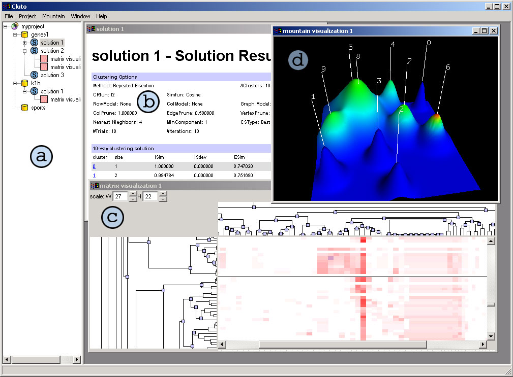
When clustering data, many pieces of information are involved, such as data files, clustering solution files, and visualizations. Like many other applications, gCLUTO uses the concept of a project to organize the user's data and work flow. When a project has been loaded, its contents will be displayed in the tree view located at (a) in Figure 3.1.
Each item in the project is presented as an icon in the tree.
When gCLUTO first opens it starts with an empty project tree. To begin work, a new project must be created. To create a new project, go to the menu bar and choose "File" and then "New Project". A file dialog window will appear. Specify a name for your project and a location on your computer to save it.
gCLUTO will create a directory, called the project directory. The Project Directory will be named after the project and stored at the specified location. Within the project directory, gCLUTO will save all the information related to the project.
To open an existing project, choose the "File" menu and then "Open Project". A file dialog will appear. Navigate to the location of the project directory and open it. Within the project directory there will be a file named "project_name.prj", where project_name will be the name of the project. Choose this file and click "Open".
After these steps, a project will be loaded and displayed in the project tree.
gCLUTO accepts the same data formats as CLUTO. See CLUTO's documentation for details on the exact formats. gCLUTO allows for the inclusion of the following file types in creating a new data item:
To import a new data item go to the menu bar and choose "Project" and then "Import Data". The Import Data dialog will appear allowing the user to specify the location of a file for each of the file types listed above. Clicking on a "Browse" button will bring up a file dialog to allow the user to locate the needed files. Only the *.mat file is required. The user must also specify whether the *.mat file contains matrix data or graph data by selecting the appropriate option.
If the *.mat file is chosen first, gCLUTO will try to guess the location of the optional files (*.rlabel, *.clabel, *.rclass) by appending the extension onto the *.mat filename. For example, for a file named genes.mat, gCLUTO will guess genes.mat.rlabel for a row label file. If such a file exists, gCLUTO will make it the default file to open in the "Browse" file dialog.
After specifying these files, the user may give a label for the data item. If no label is given, the data item will be labeled after its *.mat file with the extension removed. After clicking "OK" in the Import Data dialog, gCLUTO will attempt to read in the chosen files. If no errors are encountered, gCLUTO will add the new data item to the project tree and open a Data View. The Data View allows the user to view the data and verify that it has been loaded correctly.
If data has been imported using the steps given in 3.3 then it is ready to be clustered. Clustering can be initiated two different ways. The first is choosing "Cluster" from the pop-up menu that appears when you right-click on a data item in the project tree. Secondly, the very same menu can be found in the menu bar under "Data" if a Data View is open.
After choosing "Cluster" in either menu a Clustering Options dialog will appear with all the options available for clustering. These options work exactly the same as in CLUTO. For an explanation of their meanings see CLUTO's documentation. Only particular options make sense together. To help make sensible choices, gCLUTO will autmatically update the dialog as the user makes choices to ensure that only reasonable choices are available.
Once the clustering options are chosen, click "Cluster" in the Clustering Options dialog. After gCLUTO finishes the clustering calculations it will respond by creating a solution item under the clustered data item in the project tree.
gCLUTO will also automatically open a Solution View similar to (b) in Figure 3.1. This view contains the options used for clustering and several statistics about the clusters. The report is designed after the report given by CLUTO. For further explanation of its meaning see CLUTO's documentation. In addition, the report contains links, similar to a web page. Clicking on these links allows for quick navigation between related information in large reports.
gCLUTO has been designed to facilitate clustering of the same data multiple times. If a previously clustered data item is chosen for clustering again, the Clustering Options dialog will appear with the options that were used the previous time. To reload the options used for creating a particular solution, right-click the desired solution item in the project tree and choose "Recluster" from the pop-up menu. This will bring up the Clustering Options dialog with the solution's options loaded. This feature eases the process of repeated adjustments to clustering options.
Currently, gCLUTO contains two visualizations: the Matrix Visualization and the Mountain Visualization. Visualizations can be generated from solutions by choosing the desired visualization from the solution menu. This menu can be found by right-clicking on a solution item in the project tree or in the menu bar under "Solution" if the user is currently working in a Solution View.
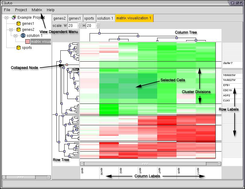
The Matrix Visualization is similar to the matrix visualization produced by CLUTO. The former extends the latter by making the matrix interactive. A detailed explanation of the visualization is given in CLUTO's documentation.
In the Matrix Visualization, the orginal data matrix is displayed such that colors are used to graphically represent the values present in the matrix. gCLUTO uses white to represent values near zero, increaingly darker shades of red to represent large values, and increasingly darker shades of green to represent negitive values. The rows of the matrix are reorder, such that rows of the same cluster are together. Black horizontal dividers separate the clusters.
If tree building is enabled, the Matrix Visualization will contain trees located above and to the left of the matrix. If an agglomerative clustering algorithm was used, the tree generated during clustering is displayed as the Row Tree. Otherwise, a tree is generated to fit the clustering solution. The Column Tree is generated by performing agglomerative clustering on the inverse of the matrix.
If row and column labels were chosen when the data was imported, then they will appear below and to the right of the matrix. Labels will only show if space is available to display them.
To help explore the information contained within the Matrix Visualization, several features have been implemented. First, the size of the matrix can be scaled in multiple ways. Second, the trees can be used to collapse and expand areas of interest within the matrix.
The easiest way to scale the matrix is with the scaling controls located directly above the matrix. Scaling can be changed by entering a new size in the text box, or by clicking on either of the up or down arrows. The control labeled with "W" controls the width of the matrix and the control labeled "H" affects the height. These scaling controls change the dimensions of the entire matrix and are convenient for zooming in and out of areas of interest in the matrix.
Often times the user needs to enlarge one area of the matrix, yet shrink areas that are not as important. This type of scaling can also be done. To resize only a portion of the matrix, start by selecting the area to be resized. Selection is done by clicking on any cell and draging the mouse to another cell. These two cells will become the corners of the selected region. Cells that are selected are shaded blue. To resize the selected region, place the mouse over any edge of the region. The cursor will change to a resizing cursor. Click and drag the edge to the desired location. The selected cells will then resize to fit within the new region.
Lastly, the matrix can be restored to its orginal scaling by choosing "Matrix" from the menu bar and then "Reset Sizing". The matrix can also be automatical scaled to fit the screen by choosing "Fit to Screen" in the "Matrix" menu.
The Row and Column Trees allow for collapsing and expanding of the matrix. Blue squares in the tree represent nodes that are fully expanded. Clicking on any expanded node will collapse it. Collapsed nodes are represented as pink squares. When a node is collapsed, all of its descendents are hidden. If a node in the Row Tree is collapsed, all of the rows of the collapsed region are hidden and replaced with a single row that contains their average. Simply click a collapsed node to expand it again. The Column Tree works in a similar manner.
The labels will change to describe the collapsed regions. If a region contains rows which all belong to the same cluster, then it will be labeled with the cluster id. If multiple clusters are present in a collapsed region then it will be labeled "multi-cluster".
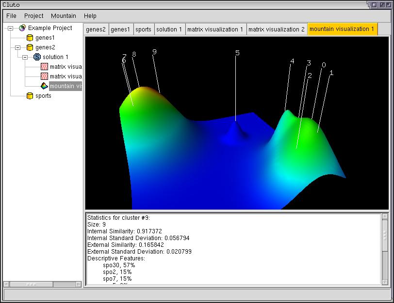
The Mountain Visualization is used to visualize the relative similarity of clusters as well as their size, internal similarity, and internal deviation. In the mountain visualization, each cluster is represented as a peak in the 3D terrain. A peak's location, volume, height, and color are all used to protray information about the associated cluster.
The user can navigate through and around the 3D visualization by clicking and dragging the mouse over the 3D display. Different mouse buttons perform different actions.
The location of the peaks in the plane is determined using Multidimensional Scaling (MDS) on each of the cluster mid-points. MDS attempts to preserve the distances between vertices as they are mapped from a high dimensional space down to a lower dimensional space. In this application, cluster mid-points are used as vertices in MDS and are mapped to a two dimensional plane.
MDS allows users to make inferences about their data using the Mountain Visualization. For example, in Figure 3.3 a data matrix was clustered into ten clusters. The Moutain Visualization represents these ten clusters as ten peaks labeled by their cluster id. Although ten clusters were requested, MDS has placed the peaks in two distinct groups. We can infer that clusters within each group are strongly similar, while widely different from clusters in the other group. Thus, the visualization suggests the data would better lend itself to a two-way clustering.
The shape of each peak is a Gaussian curve. This shape is used as a rough estimate of the distribution of the data within each cluster. The height of each peak is portional to the cluster's internal similarity. The volume of a peak is portional to the number of elements contained within the cluster. The resulting Gaussian curves are added togther to form the terrain of the Mountain Visualization.
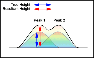
Note: When comparing peak heights keep in mind that the Mountain Visualization has added the peak curves together. As seen in Figure 3.4, the resultant height is taller than the true height.
The color of a peak is proportional to the cluster's internal deviation. Red indicates low deviation where as blue indicates high deviation. Only the color at the tip of a peak is significant. At all other areas, the color is determined by blending to create a smooth transition.
Clicking on any label will load statistics about the associated cluster into the text window located below the visualization. This information is identical to the information found in the Solution Report. If column labels have been chosen for this data, then the Mountain Visualization can display the most common features above each peak. This option is called "Show Features" and is found in the "Mountain" menu.